Timeline: Mar - Jun 2016
Project Type: School Project
My Role: Product Designer, Front-end Developer
Tools: Sketch, JQuery, Google Calendar API
Skills: Interaction Design, User Research, Software Development
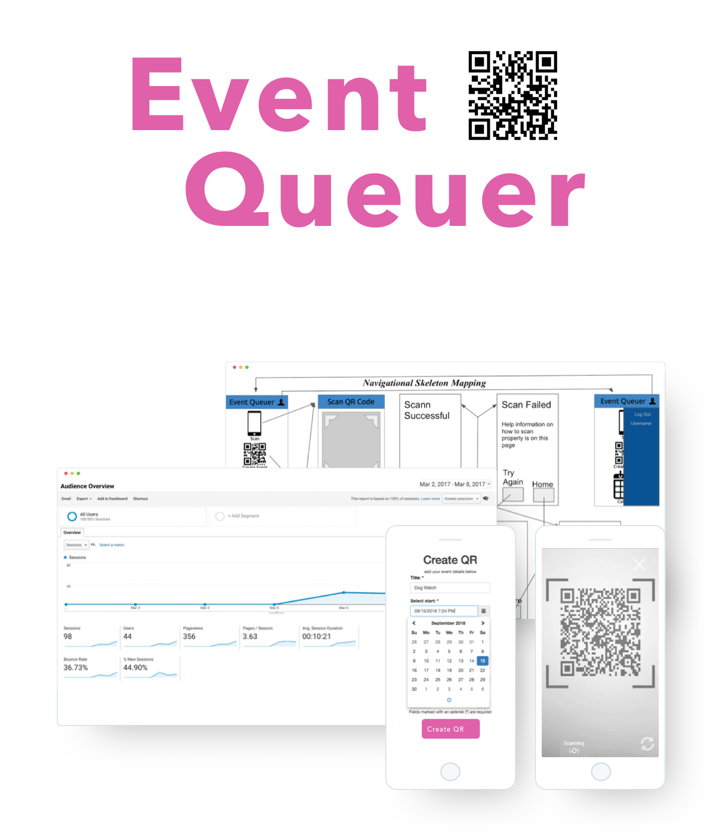
Event Queuer is a mobile web app that lets users share calendar events through QR codes. It can encode event details into a QR code and scan an "event QR code," which syncs the details into the user's Google Calendar.
Check out the finished app here

Full compatibility with Android devices only
This project was created during my first interaction design course at UCSD. The class prompt was to find unique ways to solve common user problems. I teamed up with two other undergrads and took on a hybrid designer/developer role.
We started by interviewing strangers around campus, asking if they had any troubles with university life. The most frequent complaint was related to time management due to heavy course loads, social events, and professional circles. Users struggled to keep track of what was happening around campus because different clubs used different platforms (Facebook, Instagram, UCSD website).
Storyboards
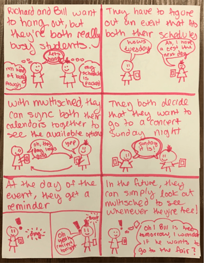
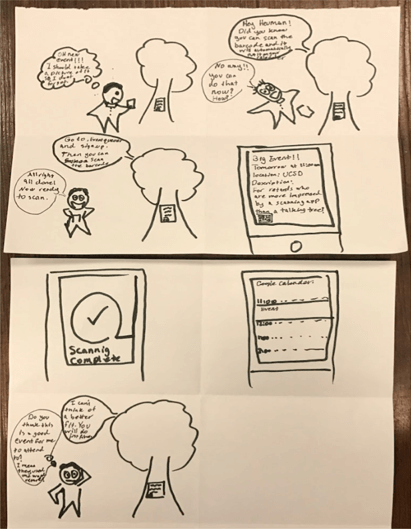
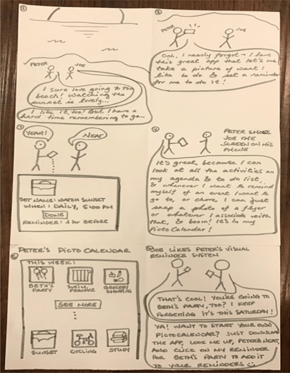
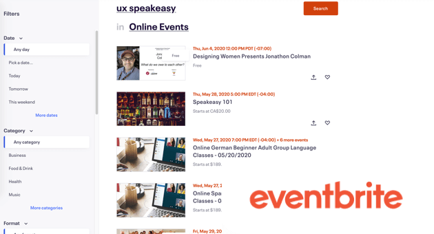
Although events were sometimes listed on websites like Facebook and Eventbrite, flyers and bulletin boards were the most common medium to share events at UCSD. Students felt that manually scheduling reminders for these events was a tedious process.
Problem Statement: Students needed a way to keep track of events in an integrated system to be better connected with the community.
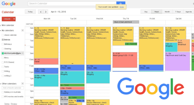
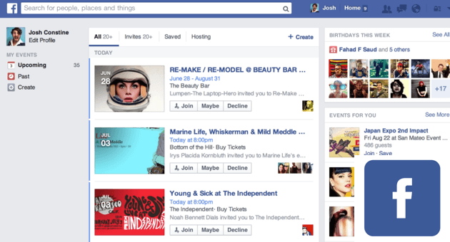
Next, we created a competitive analysis on existing time management and event scheduling apps. We focused on their weaknesses and incorporated potential solutions onto our inspiration board for ideation.
Competitor Market
Prototype by Jenny

Prototype 1: A social reminder app. We took inspiration from the stock iOS reminder app and incorporated a sharing feature so that users can share reminders with each other.
Prototype by me

Prototype 2: Creating QR encoded events that sync to the user's calendar. Our prior research suggested that students used their own digital calendars but felt burdened by the manual work of adding events from other platforms.
We tested both paper prototypes with several classmates by simulating functionality through the Wizard of Oz technique. They reacted positively to the QR scanner idea because it was a faster way of recording events into their calendar. They felt that the social reminder app was too similar to Facebook events.
We moved forward the QR code idea because it synergized well with the ecosystem of event apps at the time. We didn't want to create another platform for sharing events when there were already so many. The goal was to use Event Queuer as a bridge for these platforms to connect with the user's calendar. It could also modernize physical flyers so that they could be recorded precisely. This way, the user can focus on one calendar to see all of their events.
Wireframes
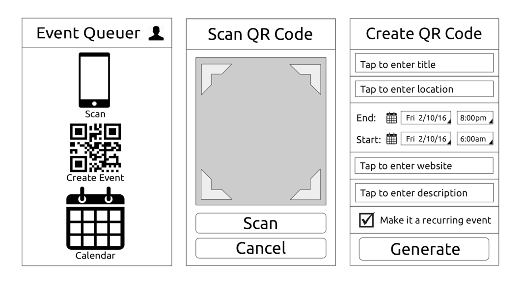
With the feedback, I simplified the UI in the lofi wireframes. I created a single level navigation framework for each of the features. The "Create event" and "Scan event" functions were now on the same visual hierarchy.
Skeleton
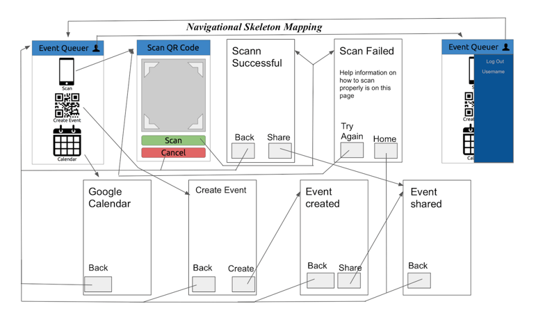
For the implementation, I worked on the UI and the QR code generator, which included arranging the event details into the correct String format for the API.
Devplan
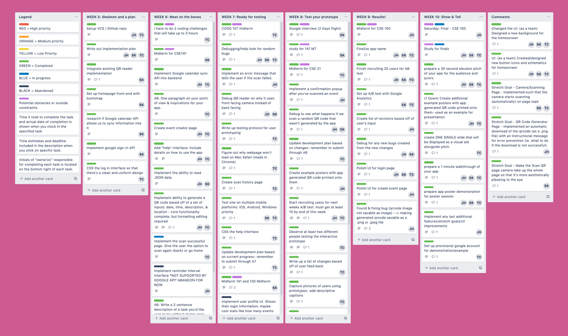
Roadblock: iOS devices restricted the access of the back facing camera for web apps.
Apple placed limitations on modifying the camera
input stream on all mobile browsers. There was no way of implementing a web based, rear QR code scanner at the time.
It still worked with Android devices but this meant that we would lose a large chunk of users. Unfortunately, we didn't have
enough time to pivot because there was only a few more weeks of class left. It was a stressful situation which taught me to always research
the tech stack before building.
Build 1

After we got the basic functionality working, we wanted to see what our users thought. Each team member was responsible for testing 4 users. I created the user testing plan while my team ironed out the remaining bugs.
Usability Tests
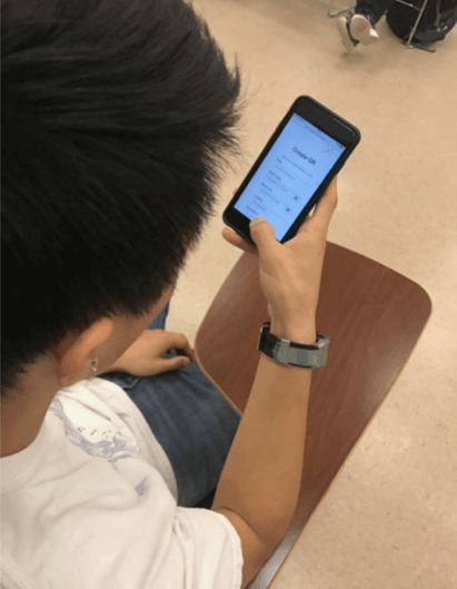
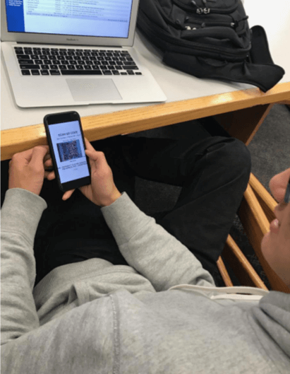
There were 4 functions being tested:
- Create a QR code for an event
- Scan and sync an event QR code into the calendar
- View the list of events you have scanned
- Navigate to the help page
We applied the feedback on the next iteration:
- Replace the create and scan icons and add a visual heirarchy which prioritizes the scan feature
- Remove the calendar
- Implement an automatic camera scanner
- Make the camera interface fullscreen
- Add a scan successful pop up
Icon
Check out the finished app here

Full compatibility with Android devices only
The biggest lesson was to thoroughly research the limitations of a design before development. Creating an app that only works for Android users was cool but ultimately it's much less impactful than a solution that works for everyone. This project is open source and can be viewed on github.
D4SD Hackathon
I competed in a city wide design competition to improve transportation in San Diego during Fall 2017.
