Timeline: Mar - Apr 2018
Project Type: Part time job
My Role: Webmaster
Tools: VSCode
Skills: Design, Web Development
The Sun God Festival is a daylong music and arts festival at UC San
Diego. Named as one of Live Nation’s "Top 5 College Concerts That
Should Be Actual Festivals", it's one of the largest university
events in the world, bringing in over 20,000 attendees each year.
I was the webmaster for UCSD’s Associated Students Graphic Studio,
which produced content for all extracurricular events around campus.
I was responsible for all of websites related to recreational
events.
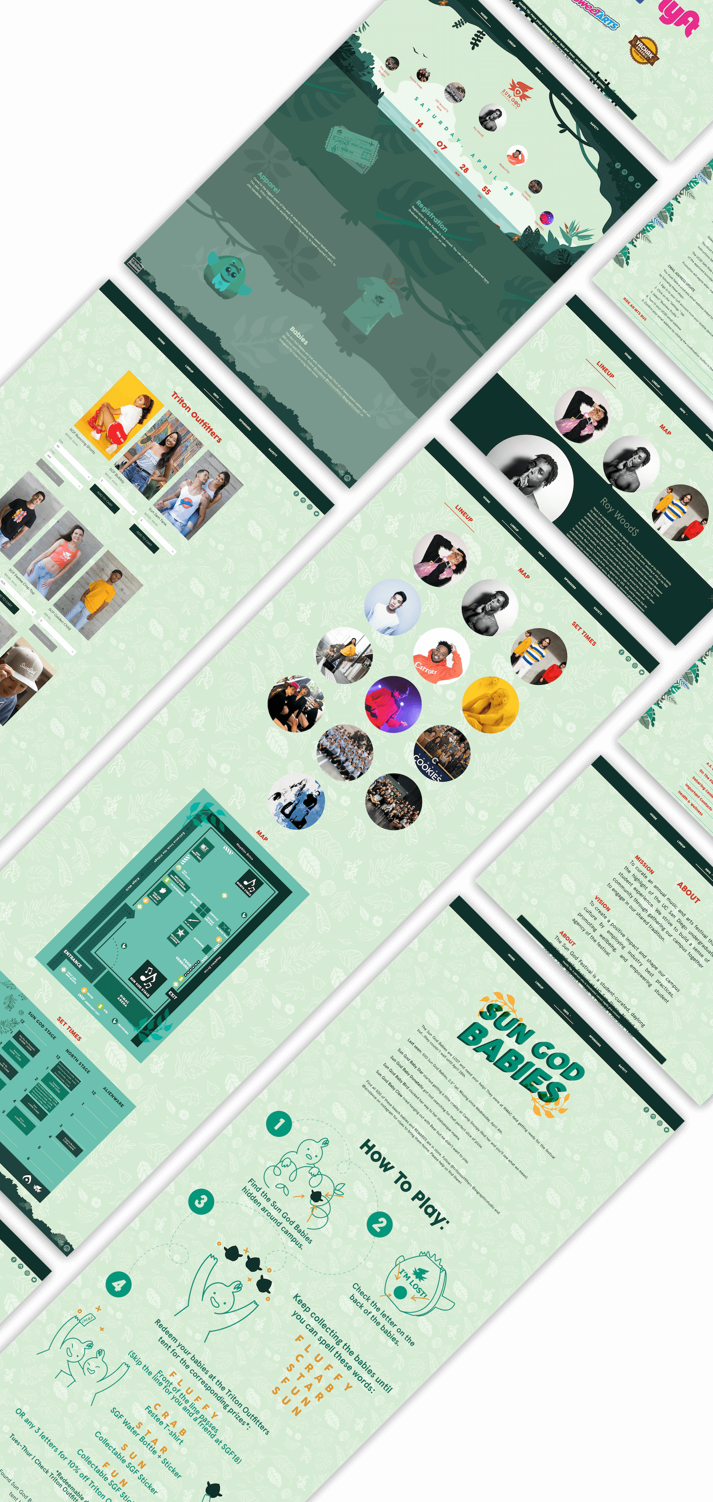
This case study goes over the 2018 Sun God Festival, which I built
with a visual designer. I worked under the constraints of the events
coordination team to design & implement an engaging user experience.
Stakeholders
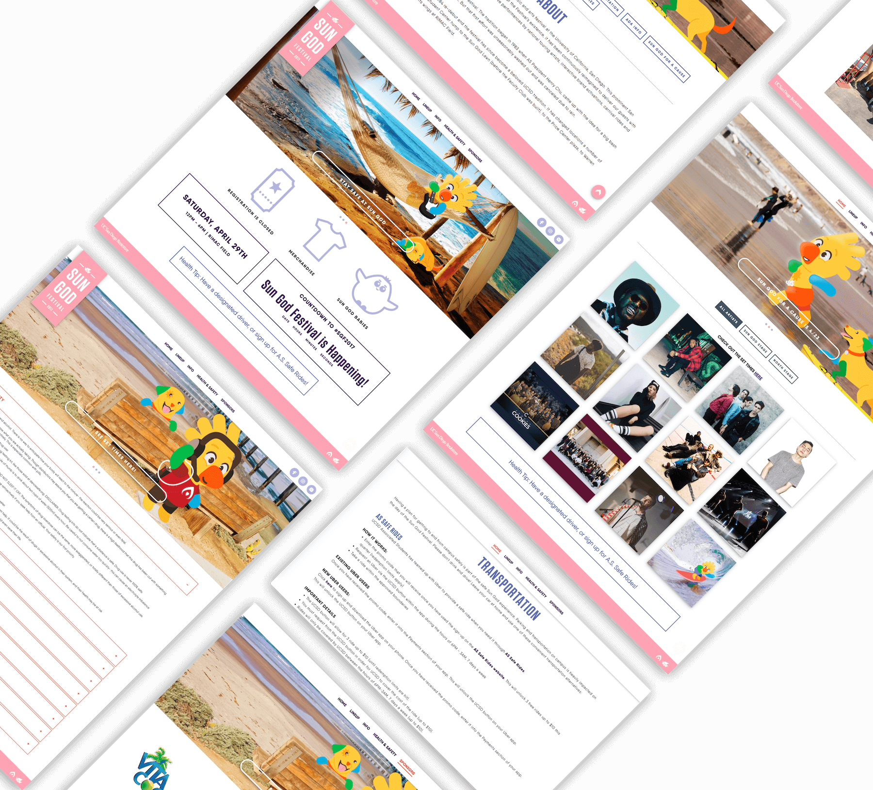
The 2017 Sun God Festival website centered around a refreshing beach vibe. The events coordination team wanted a full refresh on the website.
2017 Website
The ASGS Manager wanted a jungle theme. Both the Special Events Director and ASCE VP wanted an emphasis on safety because of the increasing number of student overdoses in previous years. The Sponsorship Director wanted a redesigned student engagement activity to increase the awareness of the festival.
Jungle Theme
Safety
Engagement Activity
I interviewed a few students around campus to understand how they felt about prior year’s website and what they thought were the most essential features.
User Data
I ran a quick n’ scrappy AB test with random students around campus (n=11). Then I presented all of the data to the ASCE board with suggestions on which designs to move forward with.
Homepage

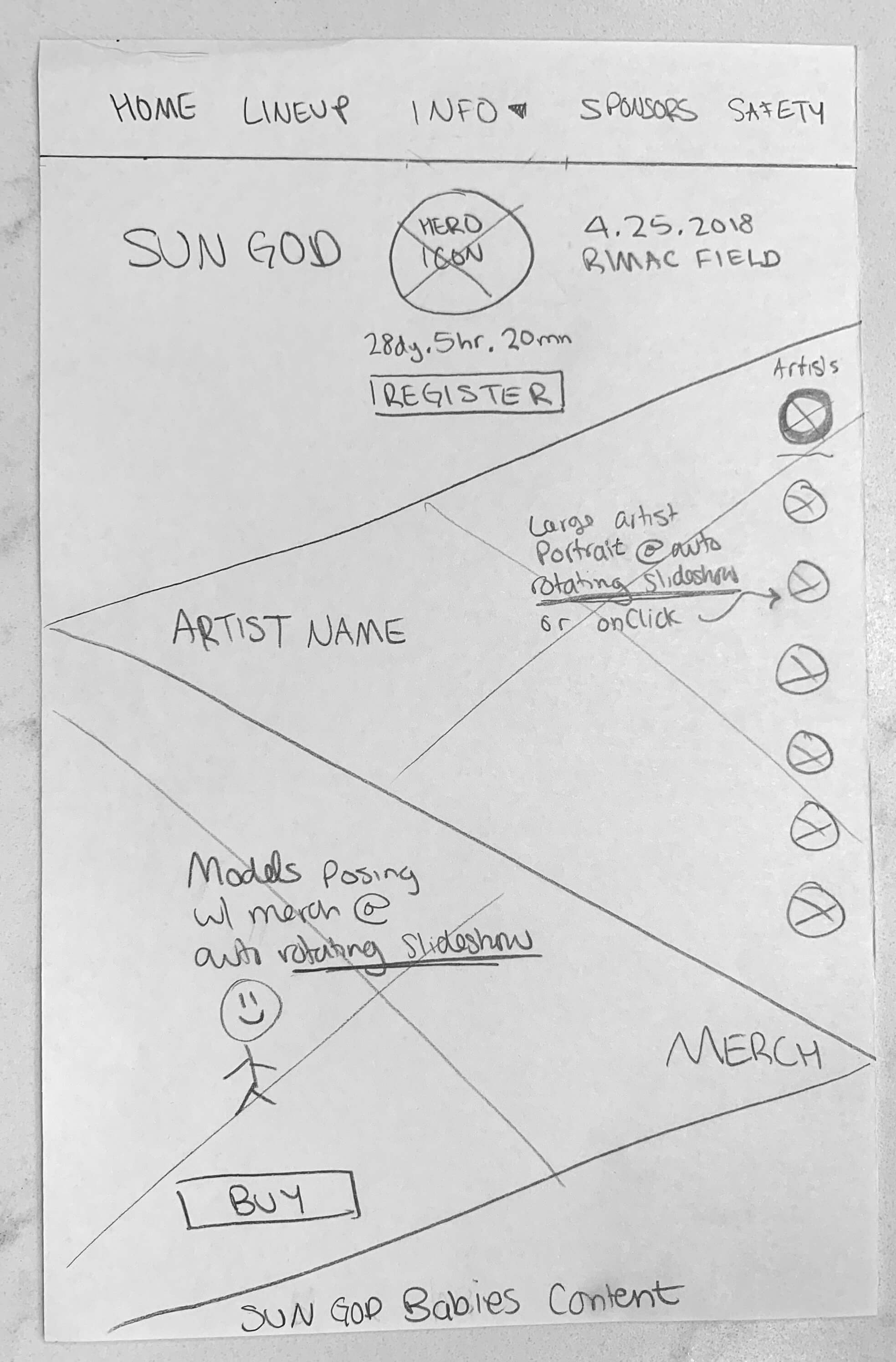

Regardless of the student's input, the events board pressed for a lower emphasis on the artists on the homepage. They wanted to highlight the apparel because that was a major source of revenue.
Safety Tips

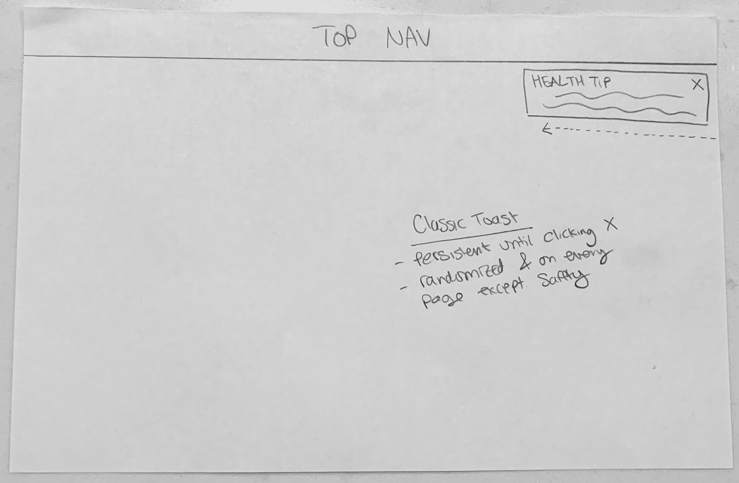
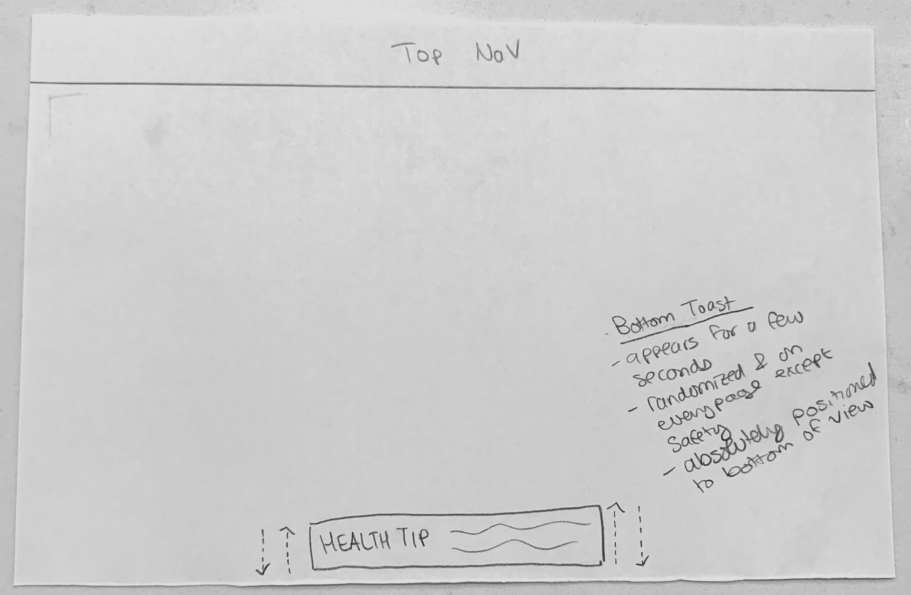
The students weren’t too fond of the safety tips but it was a firm requirement. The team had initially leaned towards the persistent bottom bar design but eventually settled on the bottom toast because we felt that an animation would better attract attention.
Engagement Activity
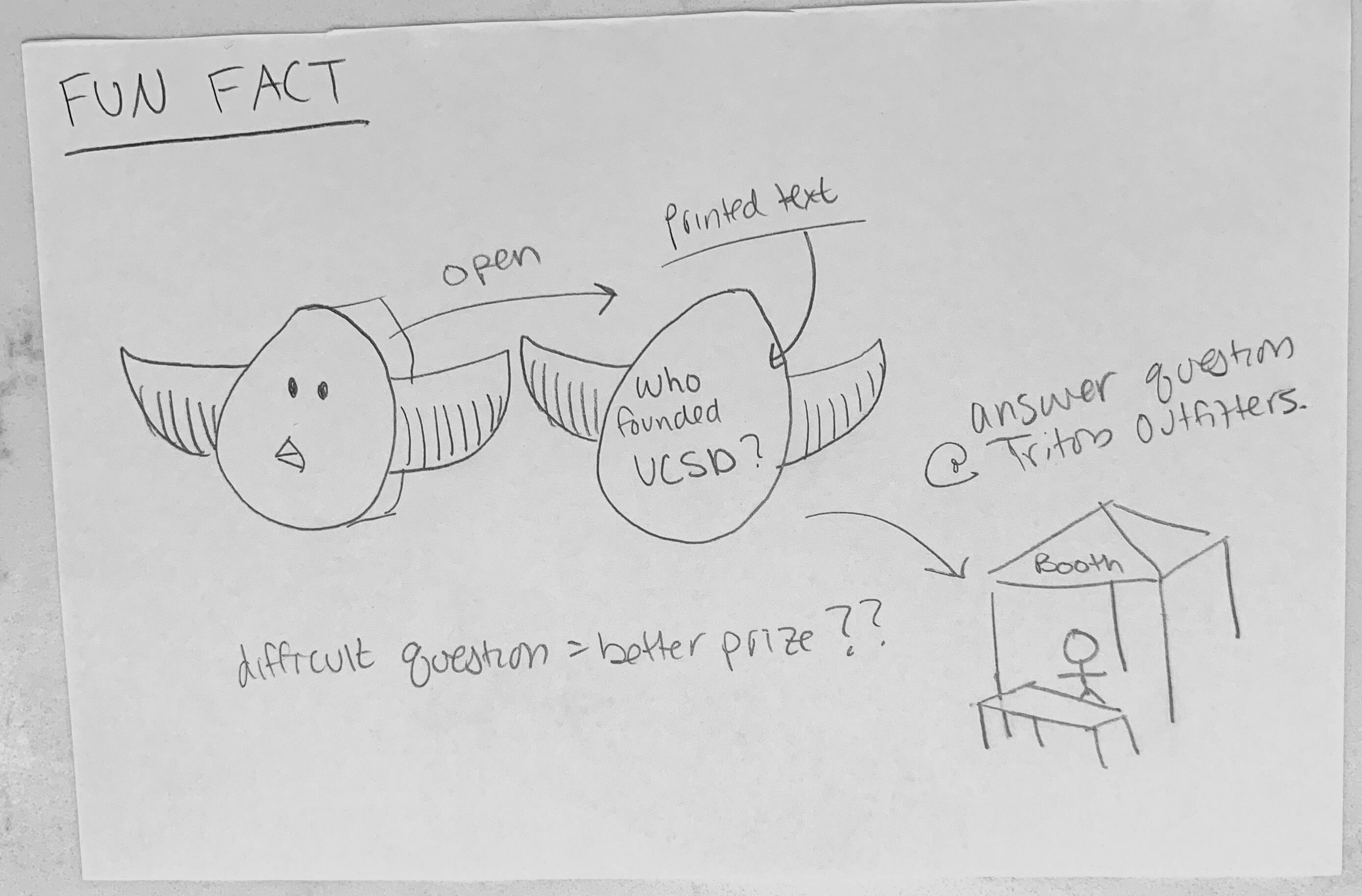
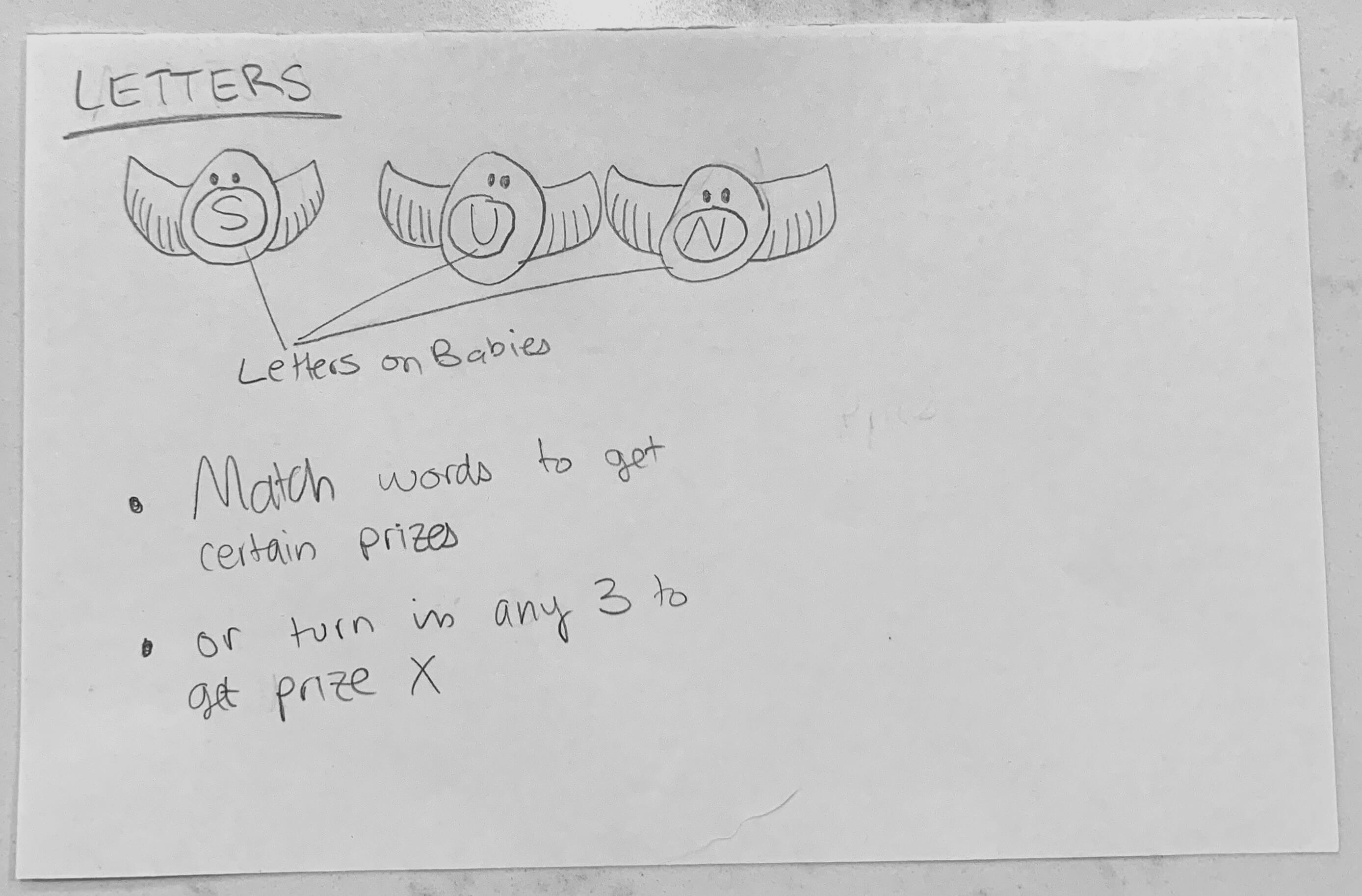
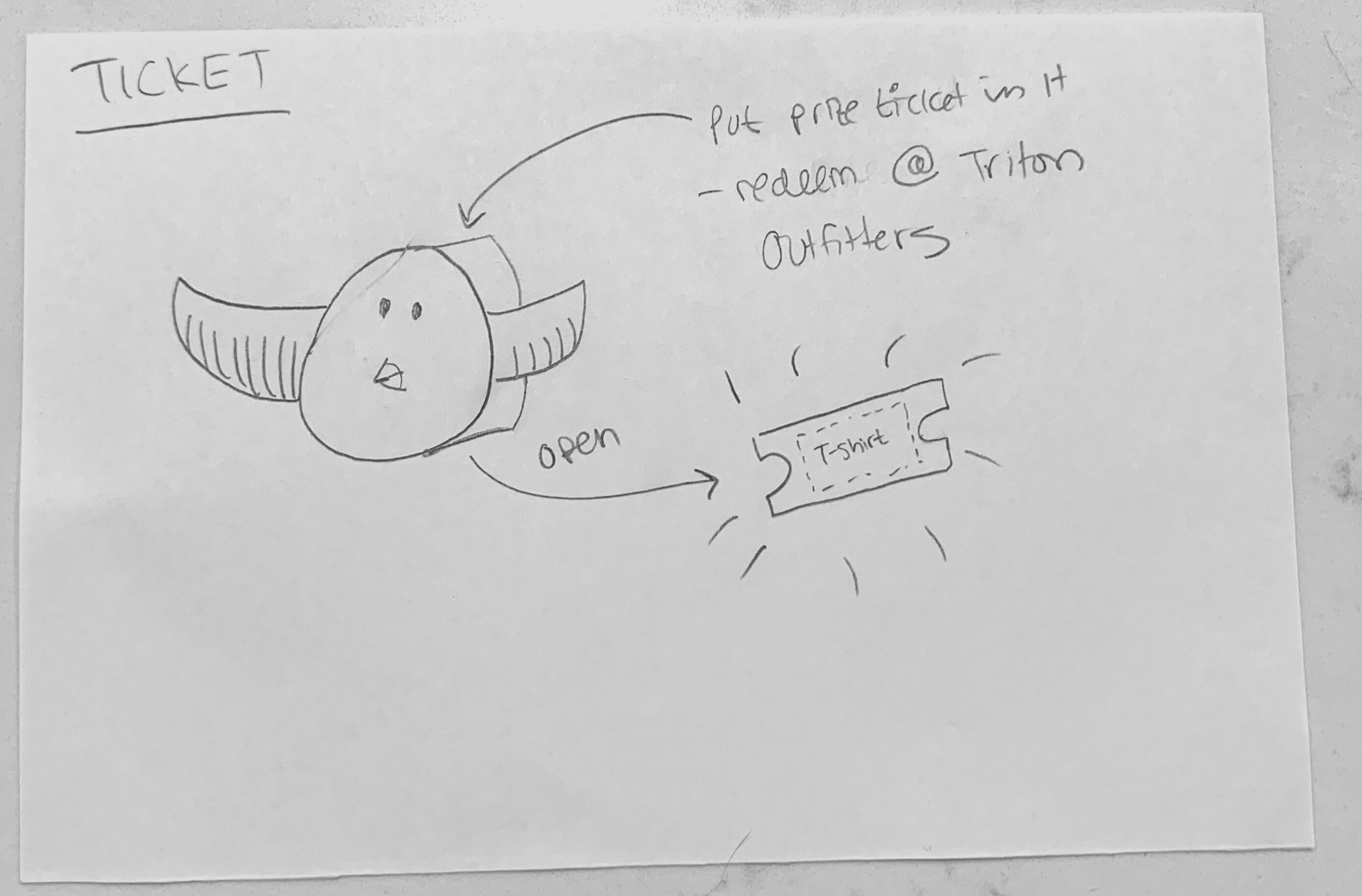
In the previous year, returning more babies resulted in a better prize. The team liked the “Letters” design because they felt that there would be more publicity and buzz if students were trading with one another.
I used Bootstrap as the css framework and JQuery for event handling. I also used Shopify’s API to embed an online shop into the apparel section of the website. The homepage’s carousel was created with carouFredSel, an open source project by Verti Studio.
Frameworks and libraries



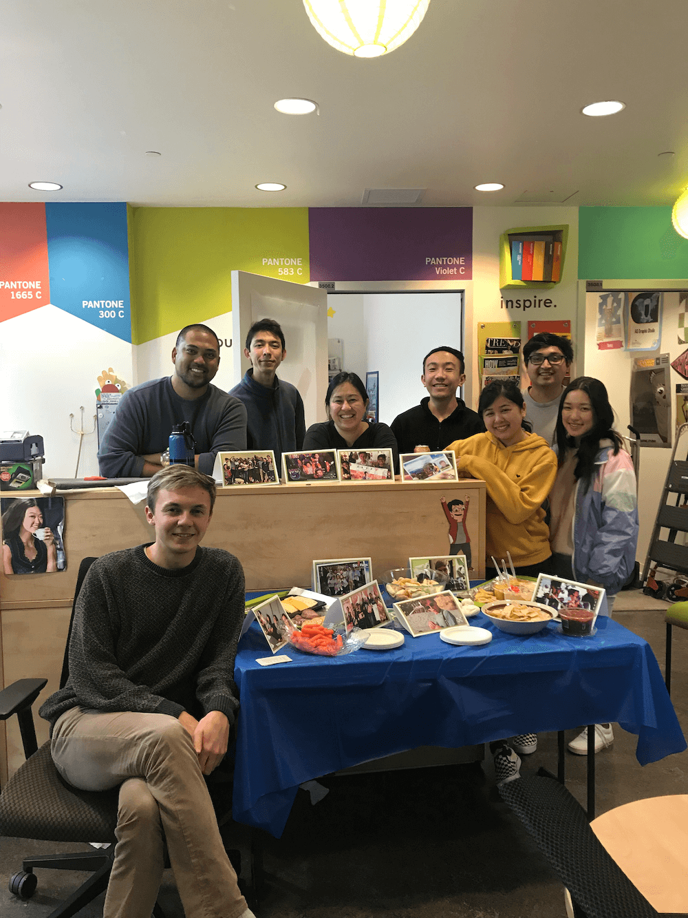
I’m stoked to have worked on a website seen by so many of my peers. The A.S. Graphic Studio was full of extremely bright and friendly colleagues. We had weekly potlucks, birthday celebrations, costume parties, and even field trips to local design agencies. I also enjoyed seeing how the inner workings of event coordination looked like. Thank you for reading.
Stakeholder avatars were designed by Freepik from FlatIcon.com.
EventQR
A web app that lets users create & scan events encrypted into a QR code, which can be synced onto their Google Calendar.
