Timeline: Jun - Sep 2018
Employment Type: Internship
My Role: Product Designer
Tools: Framer Studio, CoffeeScript
Skills: Interaction Design, Motion Design
I worked with a software developer to drive 6 animations into workday's mobile platform. I used Framer because it allowed me to give specific easing values to my developer to ensure design intent.
My task was to create animations for the top navigation bar as the user selects different items on the bottom navigation. The intent was to use motion to make the navigation experience more delightful.
Original Interaction
Ideation
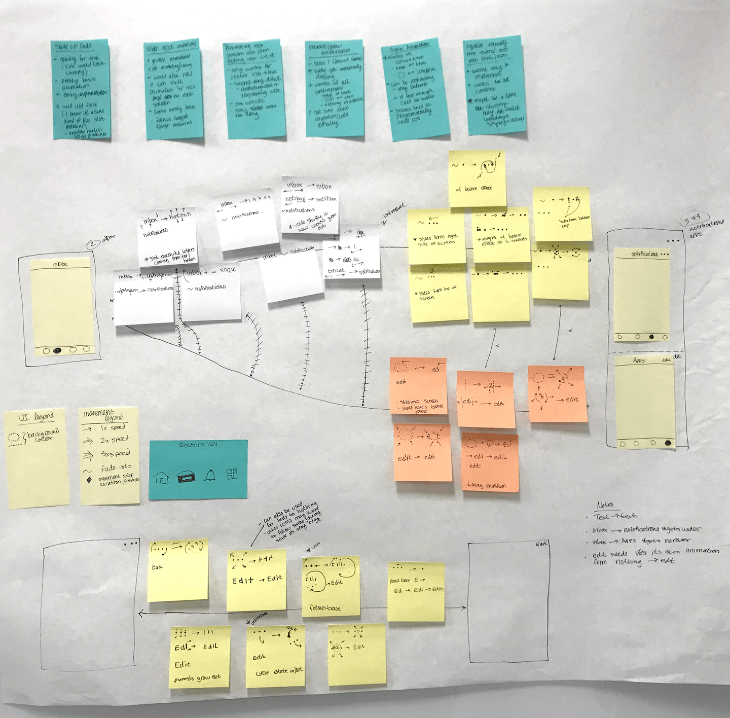
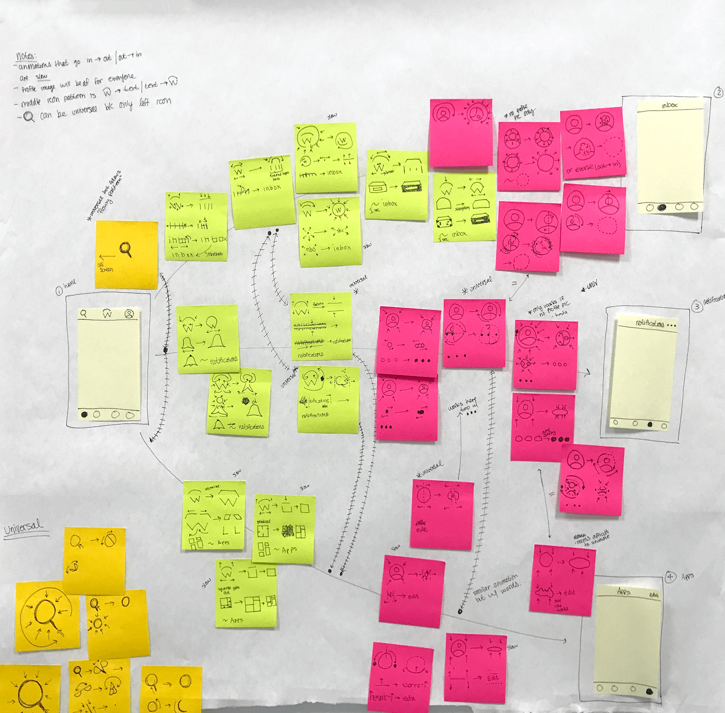
Closeup Sketches
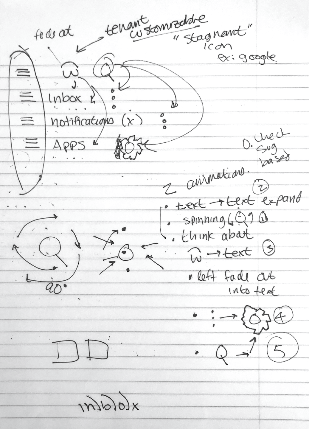
Seach → Settings
Search → Menu
In Context
The header text fades left or right depending on which tab is selected. This carousel-like experience makes the pages feel as though they're laid out next to each other rather than just one screen that loads up different content.
Android Implementation
I also animated the bottom bar icons to accompany the top navigation. I drew inspiration from Facebook's bell notification. Here are a few iterations:
Iteration 4
Iteration 6
I received a lot of feedback from the director of design during office hours. My initial iterations were very motion heavy and could distract the users. My final iteration was much more subtle and only livened up when the user received a notification to direct their attention.
Final Iteration
I also made a few mobile conclusion designs & animations to help me evaluate important elements for my other conclusion redesign project.
Original Static Design
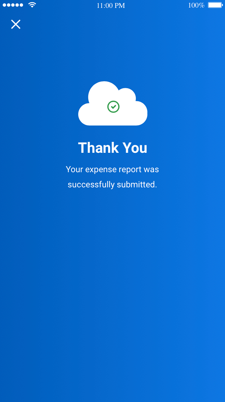
Version 3
Version 6
Version 9
Workday didn’t have many animations for data that was passed around in the flow. I made contextual animations to help direct the user’s attention as they progressed to increase confidence:
Contextual Animations
My teammate wanted to include an empty state animation that appeared when users scrolled all the way down a page or when there wasn’t enough content to fill an entire page. He was a visual designer and felt that this addition would be more pleasant than a blank page. He worked on the vectors and I created the animations.
Wind Empty State
Rain Empty State
After getting feedback, we realized that this could be distracting and didn't add much value to the user. We ended up creating a parallax effect when the user tried to scroll past all of the available content.
Parallax Empty State
Companies like Snapchat and Pinterest used a similar animation for the 'pull to refresh' interaction. Our proposed design didn't make it into the product because it conflicted with industry standards and didn't offer much customer value. It was a good lesson and I had a lot of fun making it regardless.
While I was working on animations, I also redesigned the universal
conclusion component.
View Case Study
EventQR
A web app that lets users create & scan events encrypted into a QR code, which can be synced onto their Google Calendar.
Birch Aquarium
Designing an exhibit in the Birch Aquarium at the Scripps Institution of Oceanography to teach people about bubbles.
